Our team at Flatiron School researched and developed new tools to connect influencers with sponsors that pay for their services. A fascinating market to learn about in a new world of marketing which historically had content follow rigid guidelines with advertising channels out of the control of artists.
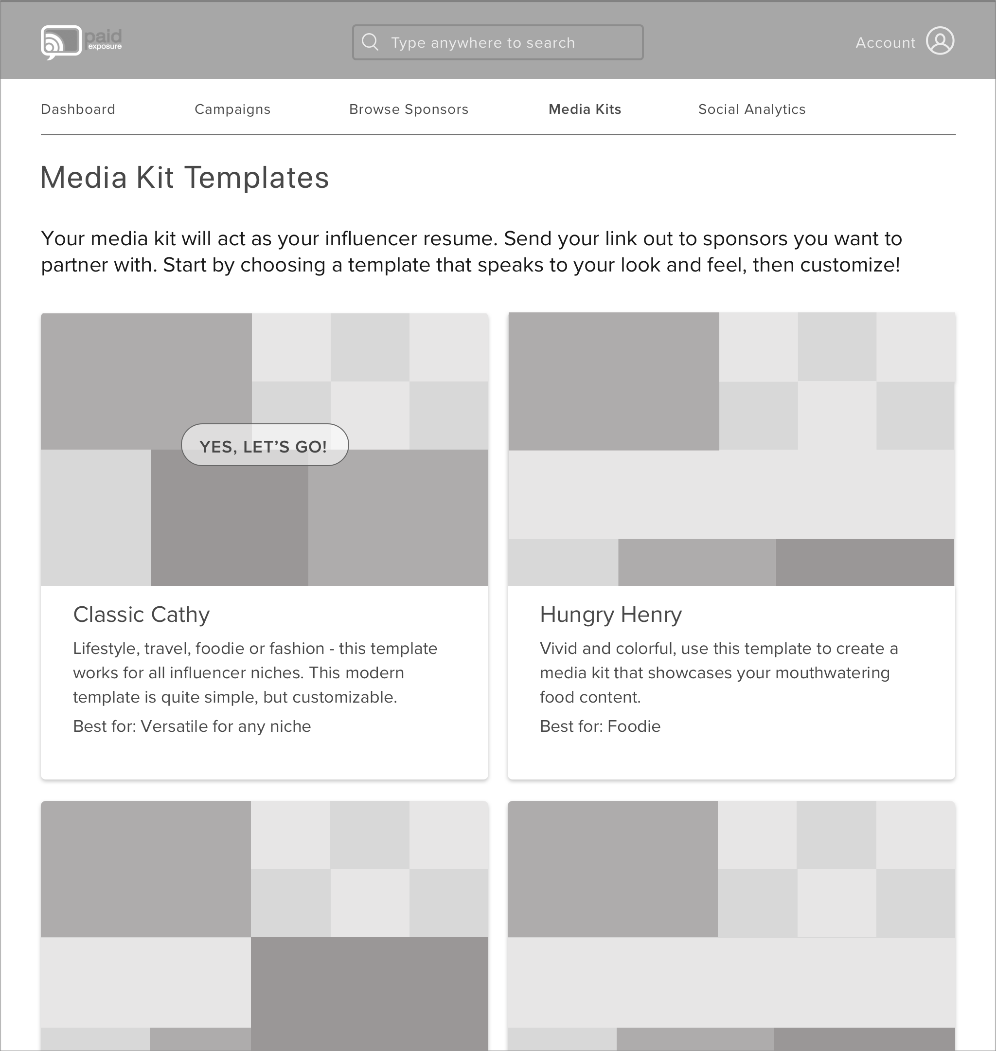
We built a dashboard, calendar system and media kit templates to make it easier for these promoters (influencers) to present their brands professionally and for sponsors to find them and book services (think of it as Squarespace for influencer portfolios).
Work: UX Research and Design
Client: Paid Exposure
Time: 3 weeks
Team Size: 5
Tools: Sketch, Axure
Design Challenge
Our Brief: Paid Exposure is a two-sided marketplace empowering social media influencers to monetize, manage and scale their business as paid promoters. Our client wanted us to recreate the calendar and profile system of their beta website in order to get these influencers to use a solid workflow management tool, and also to have brand sponsors easily view their schedules and book them through a calendar.
“Extra money at any time. Well, that’s what I want to do for people [influencers], except they don’t need expensive resources, the house or car, they just need the mobile phone, and you can make extra money that way.”
– CEO of Paid Exposure
Our Design Problem: Paid Exposure lobbed a lot of their business goals our way. They handed us their beta website, documentation, past wireframes and a spreadsheet with a list of the current features on their site.
But what was the design problem we needed to research?
We hit the ground running. Our challenge was to learn from these influencers, artists and creators in order to design tools they would actually use to help them get in front of sponsors.
The brief from the client concluded with the following objectives:

Research
Client Kickoff Meeting: We started off with a client kickoff meeting to learn about our entrepreneur, the world of influencers and to put all assumptions on the table over how these platforms are supposed to work. These assumptions would soon be tested when talking to influencers and marketers. We came out of that meeting feeling confident about the following:
Paid Exposure’s CEO had experience working with influencers in another business; he brought in some personal feedback of his own
Transparency, credibility and accountability play a large role in the wild west-esque nature of influencer marketing
Engagement of influencers as users can be ushered in if we get them to use their profiles as branding tools (AHA!)
What did we learn from SMEs and Users?
We spoke with three marketing industry experts who had experience working with influencers. We came out of our SME Interviews with three good ideas:

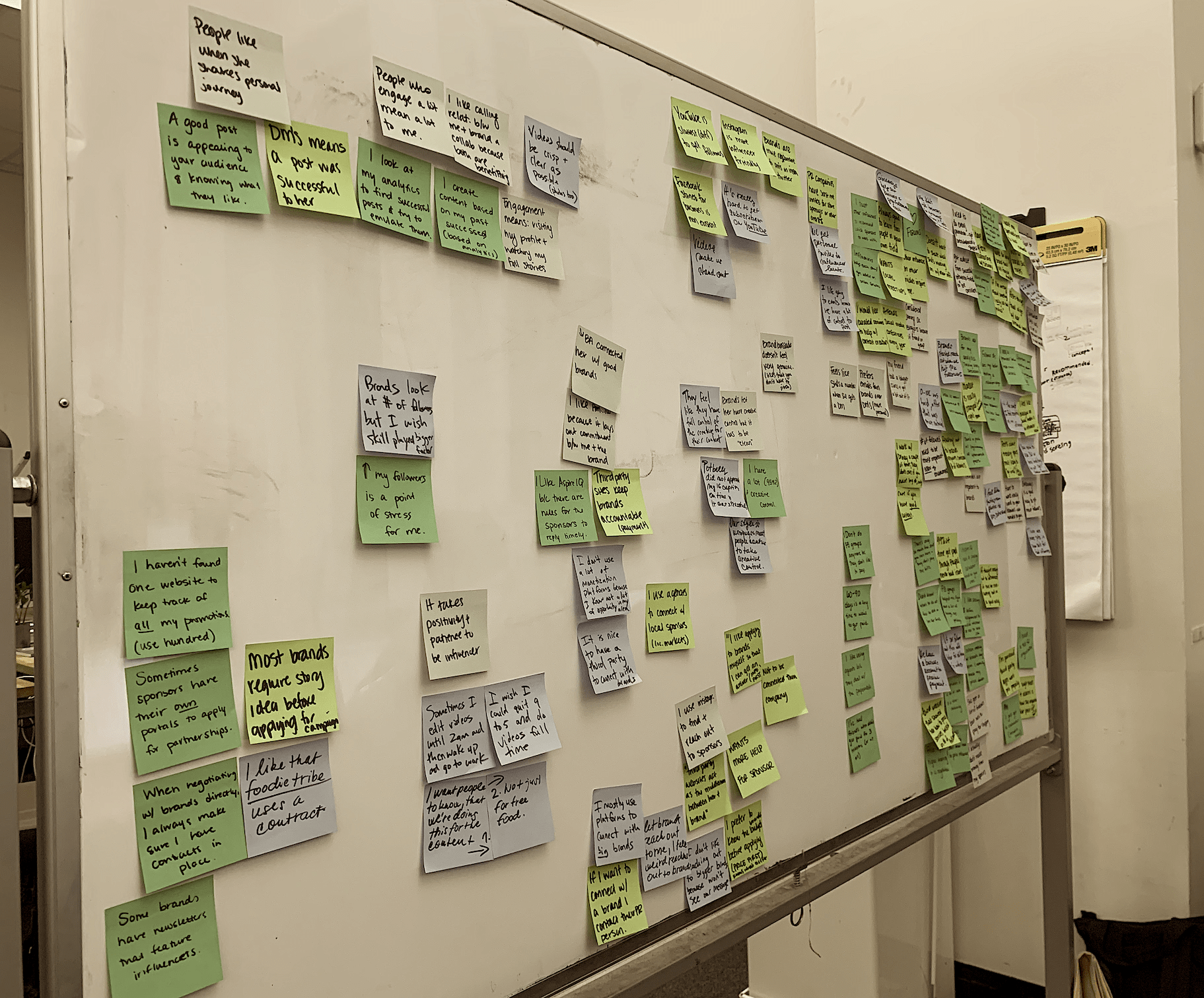
We spoke to five influencers about the challenges they face booking gigs, making connections, staying organized and managing audience reaction to their sponsored posts. We came out of our User Interviews with three user pain points:

As far as the business landscape goes, we were pleased to hear from one SME that micro influencer campaigns are effective when brands choose to focus on one niche and hire multiple micro influencers at the same time. We found room for Paid Exposure to build on these relationships if user needs are properly served.
Concepting and Testing
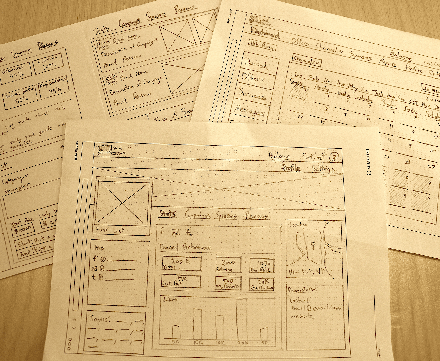
I got sketching to come up with different concepts for a dashboard and profile system that would act as a media kit. Going back to the AHA! moment in our kickoff meeting, I wanted branded profiles and a simpler navigation and dashboard to be tested with influencers for usability. I knew based on what we already heard from our users that they expected less clutter and a more practical application of their profile. I championed a simplified navigation and dashboard during our team meetings so our users had a chance to test how they felt about these experiences.
User Feedback
Feedback: Our research only took us so far. Our concepts were yet to be put to the test. It was time to back up the vision with real results from influencers who knew their needs best. We conducted our first user test by showcasing screens from our client’s beta website as an initial concept, and the changes we made to the Dashboard and Profile as another.
What were the deeper pain points of influencers and how can we build products that will help them?
Calendar:

Media Kit:

Overall:

We had to admit that we were wrong about some of the criticisms our team originally had of the beta website. Users did want more media kit functionality as expected, but also enjoyed being able to customize offerings to sponsors as individual items as seen in the original website.
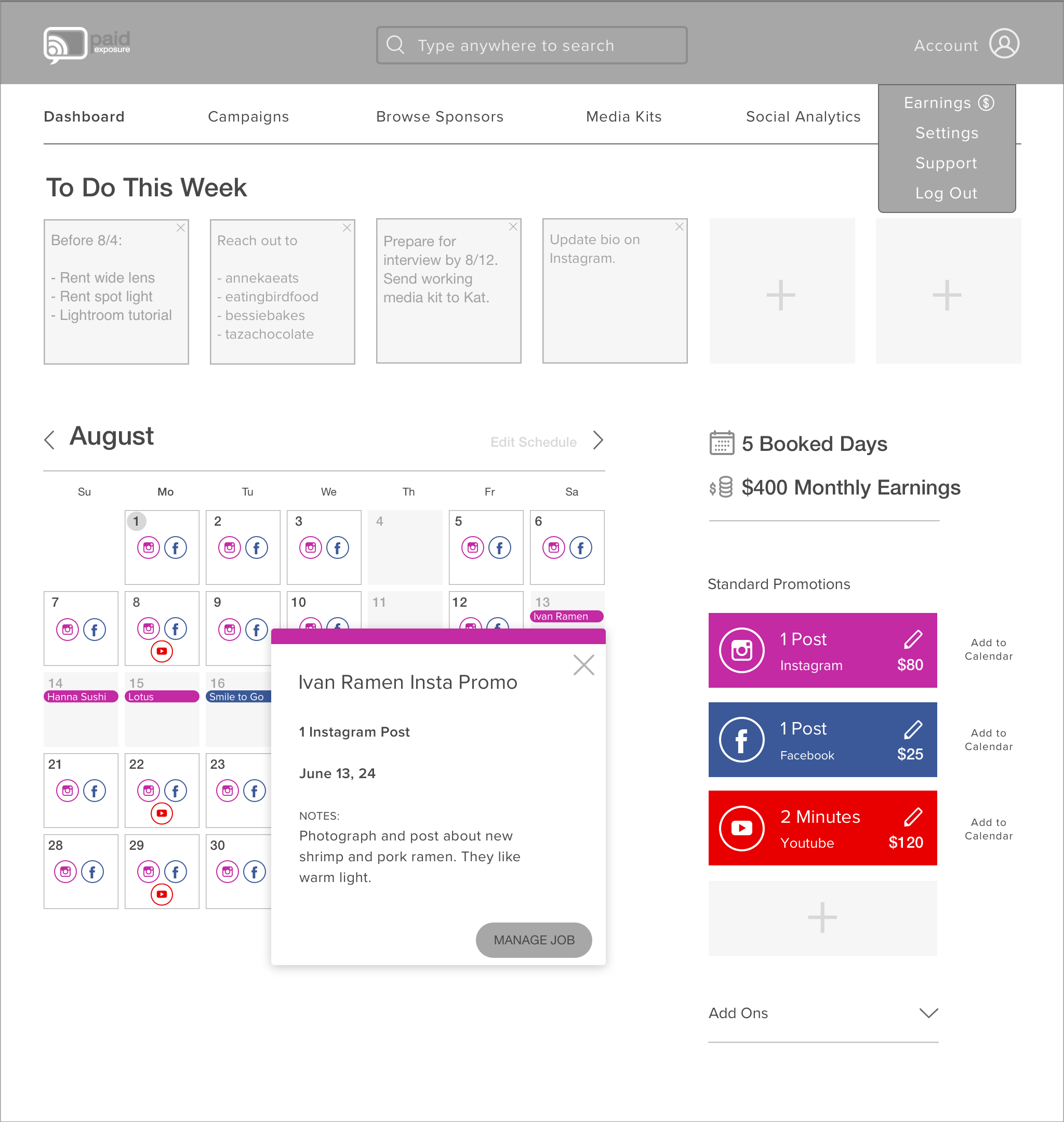
Users also wanted actionable next steps and an overview of items that were more immediate, a to-do list, to take priority over the calendar; something that wasn’t available in either concept. Oops, we hadn’t thought of that!
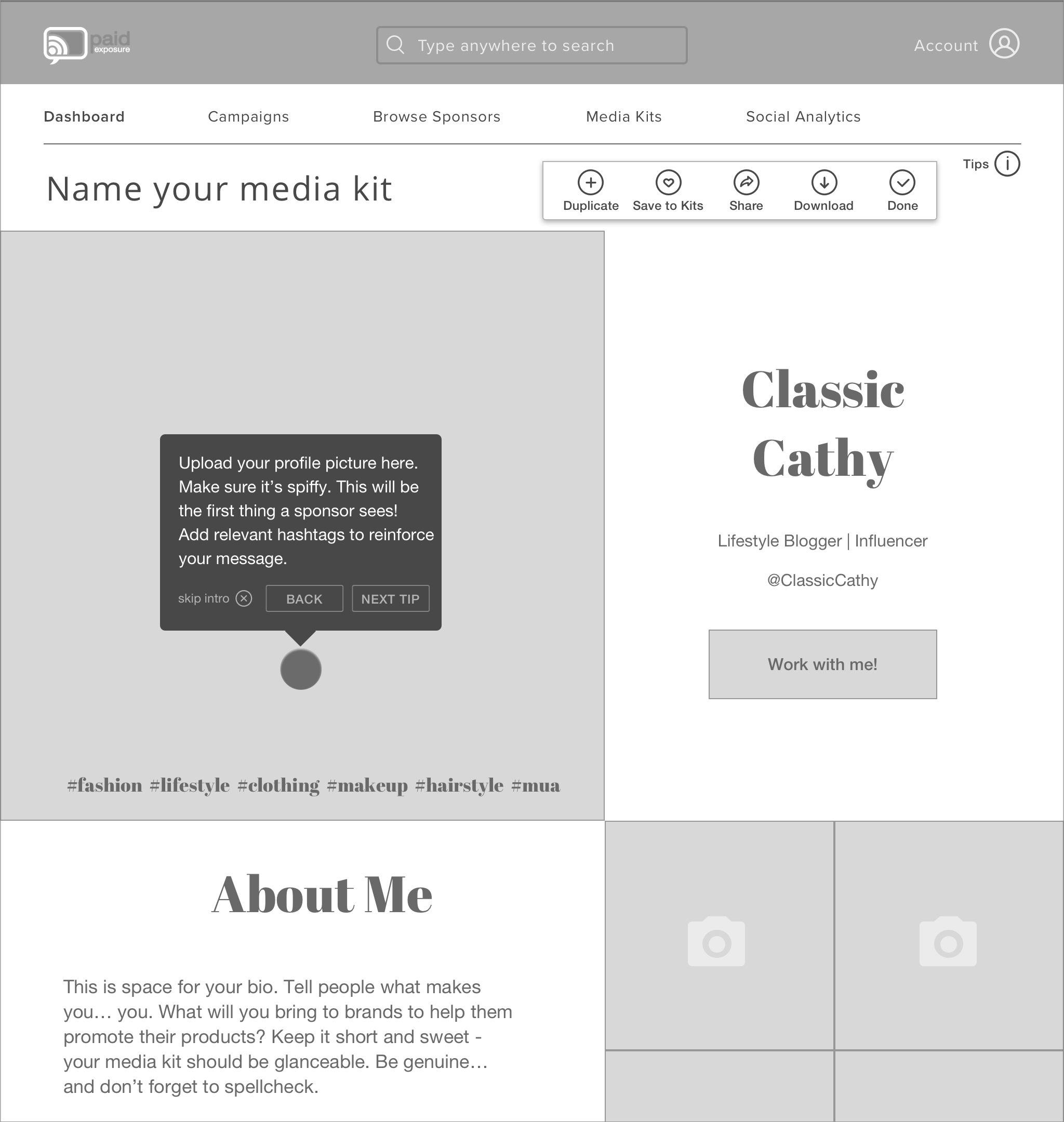
Changing Focus: We moved on to a best of both worlds approach and found a happy medium between the beta website and our designs. We gave users more of what they asked for, joining the most-liked features from both concepts. So we left influencers with an option to get granular and customize what services they wanted to add. We shined by building beautiful media kit templates with gentle instructive hints for influencers. Hints that help guide influencers on how to design for the things that brand sponsors expect to see. They came in the form of skippable pop ups and functioned as an onboarding experience for media kits.
“I like the template so that I don’t have to worry about customizing it all by myself. It’s just customizable enough.”
– YJ, Chef Influencer
A spotlight on media kits and a proper value proposition: After conducting a usability test we felt better about the picture we painted. Users wanted to engage more with our media kits. They loved the tutorials we built around the media kits, which we were scared would be seen as too much oversight. One area that remained a little unsettling to users was the redundancy of steps for additional services to be added and how it felt like an unnecessary amount of work. We thought of our prototype as showcasing an MVP of what calendar Paid Exposure should be building. It was more important to test whether users agreed or not with having multiple add on services in the first place, and a simpler dashboard. This is where user feedback turned out to be unanimously positive.
“I like the tutorial – it wasn’t too much information. I read it, and I usually hate reading directions.”
– Amanda, Food Influencer
Overall Verdict: Users were blown away with the added media kit templates and were excited to engage and showcase their work through the platform. Many users reminded us that these templates will gain exposure through other social channels with links that point back to Paid Exposure.
“This is a site where I think I can go and find the sponsor that fits me.”
– Michael, Music Influencer
Client Reception
Client Feedback: Our client was very happy to hear how users were receptive of breaking down individual services, something the CEO had made a case for. They had a lot of pushback for us over packaging services together in our original concept, something akin to what an influencer’s manager or agent might pitch for clients. We were happy that we tested this.
Future Recommendations: A good number of recommendations we found during user and usability interviews relate to Paid Exposure’s business goals. Mostly these fell out of engagement bounds when testing solely through the lens of dashboards, calendars and media kits. Some big insights into future recommendations include:

Prototype
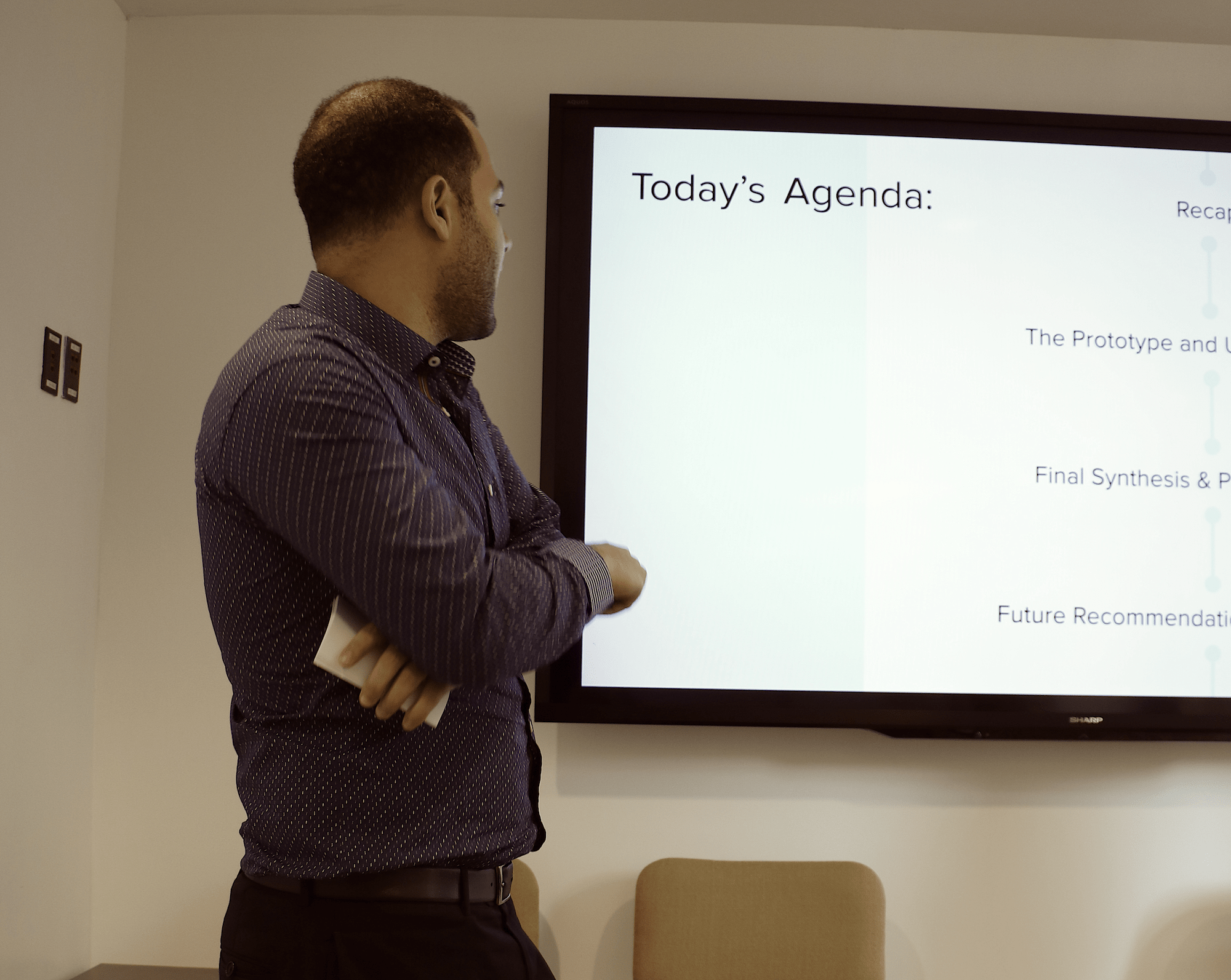
I presented our final usability synthesis to Paid Exposure’s team. Our client's excitement over the potential for media kit templates was visible in the final meeting. A developer on the team talked about how he could integrate a review system with live analytics and code the design.
Learned Insights


