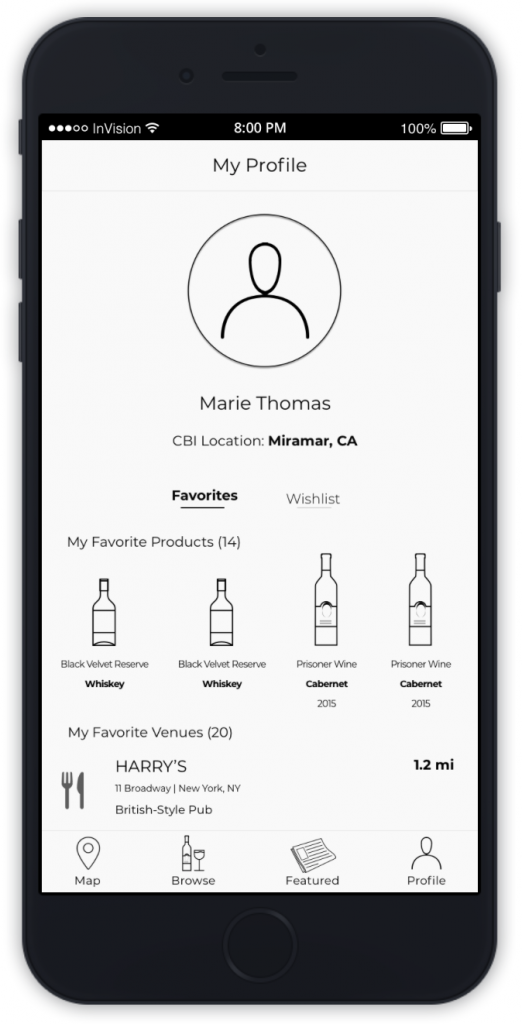
Our team at Flatiron School worked with alcohol beverage conglomerate Constellation Brands to improve and redesign the user experience of an internal facing app. We looked at employee habits when going out for dinner and drinks along with their search habits over Constellation Brands products. The app functions as a directory to help CBI employees who enjoy going out and having company products. Constellation asked us to speak to employees and carve out a new wave for the app to help advocate for and be a resource to more employees.
Work: UX Research and Design
Client: Constellation Brands
Time: 5 weeks
Team Size: 4
Tools: Sketch, InVision
Design Challenge
Our Brief: Constellation Brands is a Fortune 500 company with more than 100 brands that has 8,000+ employees and serves 9 million customers. They asked our team to help with an internal app to have employees support their sales accounts, enjoy their branded products and act as Constellation Brands ambassadors.
Our Design Problem: Constellation knew that the internal-facing application could also do much more and that their new intended user base (all 8,000+ employees) is radically different than their sales teams. Our challenge was to find out ways to improve employee interaction with branded products using a new Ambassador App design.
The version of the app we were presented with was ported over from an existing sales team app—it wasn’t ready for prime time, however it did have the following features:

Research
Client Kickoff: Constellation wanted to meet with our team at the beginning of the 5 weeks and send us off to the races with employee contacts to interview. We were told our work would culminate into a final presentation and handoff. We held our stakeholder interview with a Senior Application Engineer, a Product Manager and an Innovation Partner Manager who had the vision for the Ambassador App. We came out of this interview with the understanding that:
Constellation has two age groups employees fall under, younger professionals and seasoned veterans
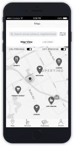
There is distinguished location types, based on “On-Premise” (dining in) and “Off-Premise” (taking out)
Employees have a motivation to buy based on an HR policy of reimbursement
Employees will find, buy and hopefully evangelize Constellation products
Constellation is looking for the app to have an educational component as well
The original sales app had too many screens and long user flows
Our Process: Next, we spent time interviewing five Constellation employees about their needs in detail. We found that employees:

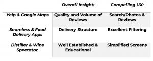
It was a challenge to research the domain; we were examining the merits of features of an internal app and little information was available. Of course, the Ambassador App bore some resemblance to popular directory and location apps used by millions of people across the globe. We stripped the competitors down to their core search and discovery features, and also took a look at niche products in the alcohol beverage industry.
Who is already doing this well?

After interviewing users and looking at successful competitor features, we set ourselves up for success by distilling the core problem and design principles as a guide.
Problem: Engaged Constellation Brands employees need a way to access comprehensive updated information on all Constellation products in the company’s portfolio to become educated members of the Constellation community.
Design Principles:
Educational: Employees should come out feeling generally confident about their knowledge of brands
Discovery: The app should surprise and delight with new inspirations
Adaptive: The app should be as specific as an employee needs it to be
Community: Employees should be able to foster widespread connections through the app
Concepting and Testing
After spending time with research and user interviews we synthesized our data down to concept solutions that meet Constellation employees at their needs. We brainstormed features under three different concept statements.
A tool that inspires users to self-educate about new and current products.

A tool that provides rewards to CBI employees for engaging with the brand/products.

A social network for employees to connect with each other about CBI products and the places that sell them.

We drew up sketches for our concepts and went back to our users with three different paper prototypes, each representing a different concept statement.
User Feedback
Feedback: The response from users was mixed. But we pulled out the common threads:

Changing Focus: We started naturally converging to one design with the features that stood out to users from our concept testing. We boiled down our thinking into a single concept statement. Remaining to be tested was how far we can push the social features of the app without having it feel overwhelming to Constellation employees. We believed in two prototype concepts to test further.
⦿ A tool that inspires users to self-educate about new and current products through a mobile, location-based directory of CBI’s brands.
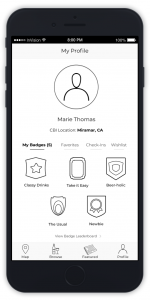
⦿ An education tool for CBI employees that encourages exploration through friendly competition, using product check-ins and badges.
Prototyping
We came back to our users this time with two full-fledged InVision prototypes. One prototype acted as our scientific control. The other prototype had an entirely new feature set: competitive badges and leaderboards.
Load Prototype 1.0
|
Load Prototype 1.5
|
Feedback:
⦿ Validation of our problem statement and design principles – users like using this app:
To locate CBI products
As an educational tool
To discover new products
⦿ Check-ins/badges 1) provide a reward, 2) separate the experience from being strictly work-related (it’s fun!), and 3) brings a social aspect to the app experience
⦿ Each section of the app should have a way of connecting users to the other sections (ex. browse items and then quickly find them on the map)
Usability Issues and Pain Points:

Final Prototype
Our team conducted one last usability test with a single prototype. This time we brought in the best of the best. We improved on the badges system and usability issues that users struggled with in the first round of usability testing.
Load Prototype 2.0
|
Overall Verdict:
⦿ Bottom navigation organization of the app was in line with user priorities: Map first, then Browse (product information), then Discover and finally Profile
⦿ All of the users we tested with reported that the redesigned Ambassador App left them better educated about CBI products
⦿ Competition for badges fosters community within CBI
Usability Feedback:

Client Reception
Client Feedback: After our final presentation the team at Constellation Brands asked us tough questions over our decisions on choosing the level of connectedness and gamification with our badges and prototype. We responded to their questions with references back to sentiments we heard expressed from our users. While they like other social media apps, for the purpose of the Ambassador app it was too much engagement to ask for as an opening use case. These are features that may come with time, and with strong and constant network usage. Constellation Brands gave us the seal of approval, proclaiming that they could implement elements of our prototype practically. Out of four different prototypes from the different UX teams at Flatiron, they expressed ours was a likely candidate in the real world. We were grateful for the opportunity to deliver our work to Constellation Brands. High fives to my team all around.
Future Recommendations: A list of future usability and feature recommendations from prototype testing was delivered to Constellation Brands. These include:

Learned Insights


